Increased access to data provided by social channels helps industries not only understand demographics and relationships but also analyze historic and future market growth by looking at the patterns of a given target population's daily lives.
This year's IEEE Visual Analytics Science and Technology (VAST) Challenge covered such a scenario and a team of SAS data scientists decided to put SAS® Viya® to the test and submit a solution for both Challenge 1 and 2. The mission was to analyze the demographics and relationships of a city in the United States with access to detailed characteristics of about 1,000 residents over a period of one year. While Challenge 1 focuses on the city's demographics and social relationships of the residents, Challenge 2 considers the patterns of daily life throughout the city. The challenge was to describe the daily routines of some of the representative people, characterize their travel patterns and analyze changes over time and across seasons.
If you are interested in reading about our submission for last year's challenge, you can find all the details in this related blog post.
The process
We used tools provided by SAS® Viya to import, adjust and format the provided data. We had access to residents' home locations, buildings, employers and financial records. Some of the data files, e.g. individual transaction status updates, exceeded well above 100mio observations. We used SAS® Visual Analytics to explore and understand the cities characteristics and social patterns. Being able to understand where particular groups of residents live and work is important when analyzing travel patterns. We also utilized Esri's ArcGIS Online services to create a custom map visualizing the cities boundaries and landmarks. SAS Viya's support for machine learning (ML) and network analytics was used to analyze social patterns and relationships.
The tools
The majority of work was done using SAS Studio and SAS Visual Analytics. We leveraged some core capabilities in SAS data steps to prepare and adjust the provided data for easier analysis. In particular, we stored all provided CSV files in SAS Viya and aggregated some for easier analysis. Additional attributes such as home locations, detail building types, employer visits or turnovers were calculated. We also used Esri's ArcGIS mapping tools to create a custom map tile service representing the city's boundaries, buildings and streets. Custom maps like these can be embedded in SAS Visual Analytics for any geospatial analysis.
The solution - Challenge 1
The first challenge focuses on the city's characteristics and demographics. We identified that the average age is 39 among our representatives with some as young as 18. To better understand the geographical distribution based on age groups, we used a heat map visualization:
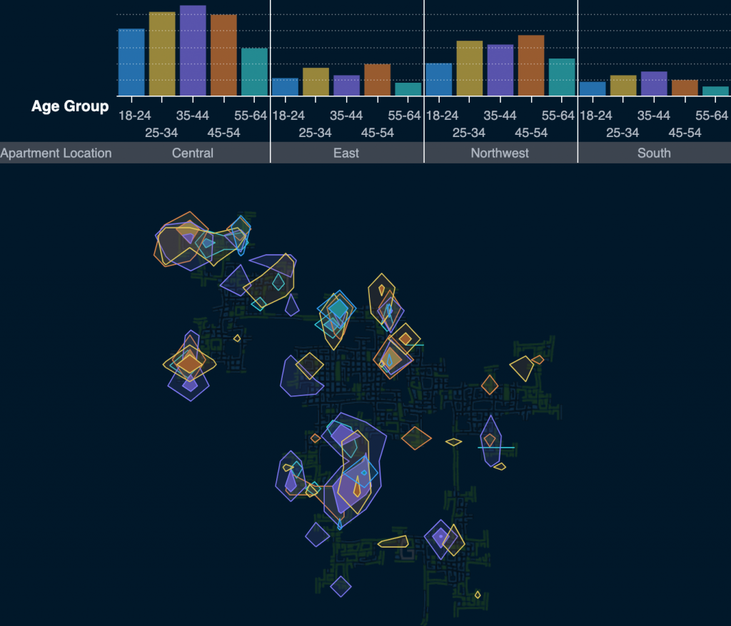
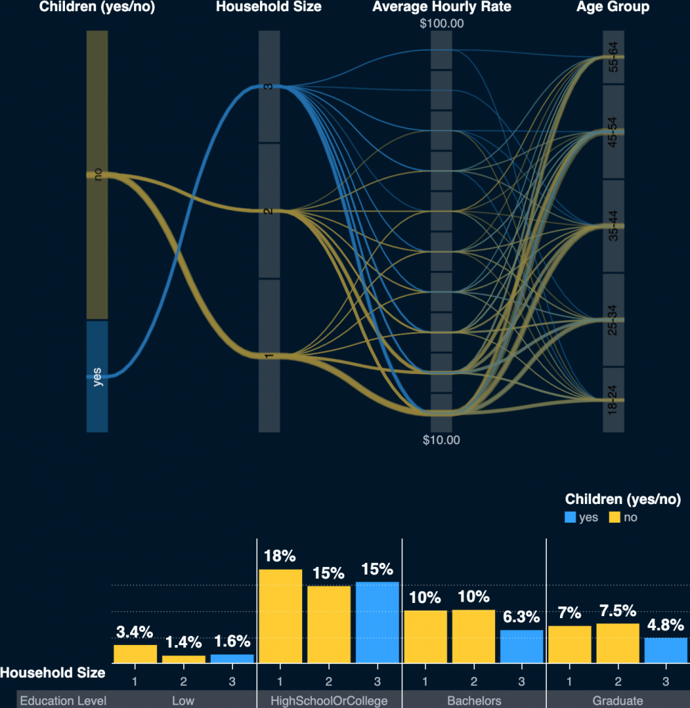
Data shows that we have residents living as single or as a family of 3. Families with children represent about 28% of the population. Most residents (about 50%) hold a high school or college degree.
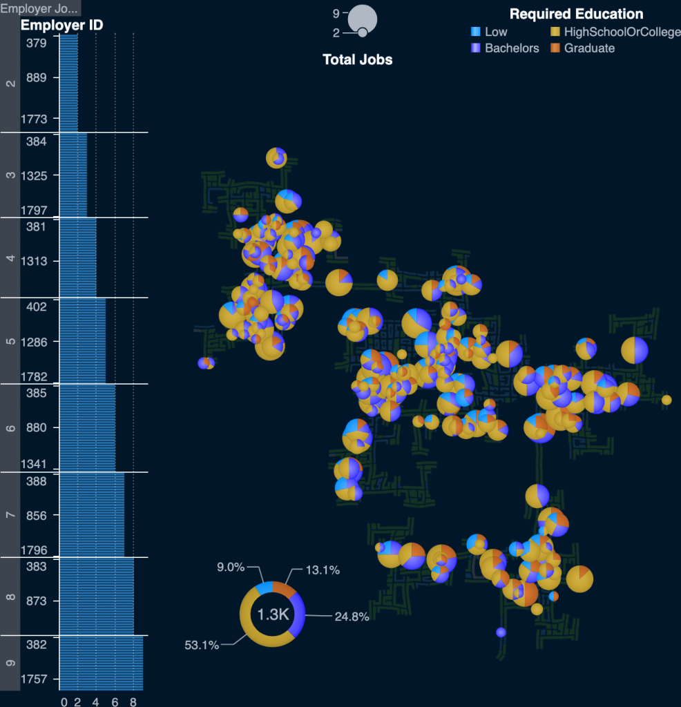
There are various schools, restaurants and pubs located throughout the city. Some are also employers for the residents. There is an average of about 5 jobs per employer in the city with some providing up to 9 jobs. Most employers (about 70%) require at least a high school or college degree.
Using SAS Viya's network analytics procedure, we searched for various travel patterns to better understand the daily social activities of the participants. When analyzing patterns, we took into account the travel end location, purpose and check-in time. Using the pattern match algorithm, we were able to determine the frequency of given patterns in the data.
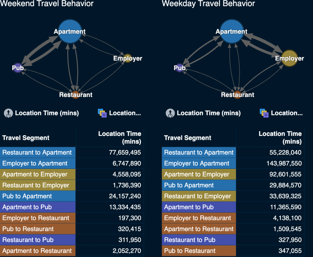
Eating out is a common activity after work and in general. The median participant ate out 469 times in total and ate out 130 times after a work day (40% of the workdays).
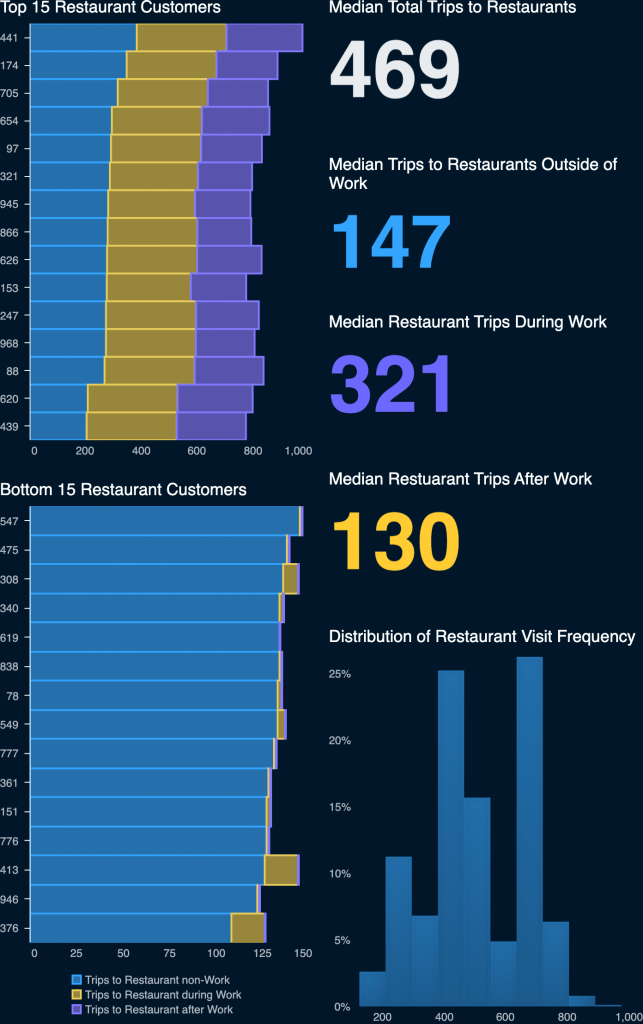
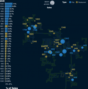
The citizens in the study primarily went to two locations during their free time: pubs and restaurants. Pubs were the dominant place to engage in social gatherings. There are five primary locations of pubs and restaurants:
- Central
- North Central
- Northwest
- East
- South
We discovered 6 clusters of weekly sale patterns by restaurants and pubs. There is no clear relationship between weekly sales patterns and location within the city. The y-axis represents normalized total sales. The higher the value, the greater the sales at that time. The clusters below are zoomed into a representative date range and are designed to show the general shape of sales patterns over time.

- Cluster 1: Consists almost entirely of pubs with the exception of a single restaurant (895) that has similar demand patterns to pubs. Saturday and Sunday both have sharp increases in sales. Weekdays tend to have much fewer sales.
- Cluster 2: Restaurants whose sales tend to be greatest during weekdays. Weekends have fewer sales.
- Cluster 3: Restaurants whose sales tend to be greatest on Saturday followed by Sunday. Weekdays have fewer sales.
- Cluster 4: Two restaurants whose sales are relatively evenly distributed across weekdays with few peaks in between.
- Cluster 5: Four restaurants whose sales are generally higher on weekdays but tend to have slightly higher sales on weekends compared to clusters 2, 3, and 4. Sales tend to be more erratic throughout the week compared to other clusters.
- Cluster 6: Four restaurants whose sales tend to peak on Sundays, with Saturday close behind.
The solution - Challenge 2
The second challenge focuses on the individuals and their patterns of daily life. We used transactional data from the participants' daily routines to identify various distinct areas in the city. Given our analysis, we were able to divide the city into areas for residential and business use.


Most of the residential buildings (shown as yellow in the figure to the right) are in the outer areas of the city which means long commutes to business locations (shown as red). Combining the business district heat map and residential information reveals a potential source of bottlenecks during peak hours as employees travel from the outer city areas into each of the business districts.
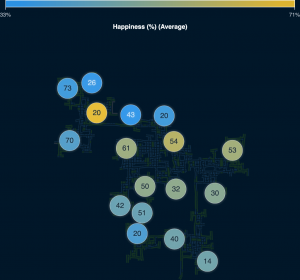
Looking into the happiness score for participants shows that the majority of people are happier if they live close to the center of the city. Likely shorter commutes, better access to facilities, and employment options contribute.
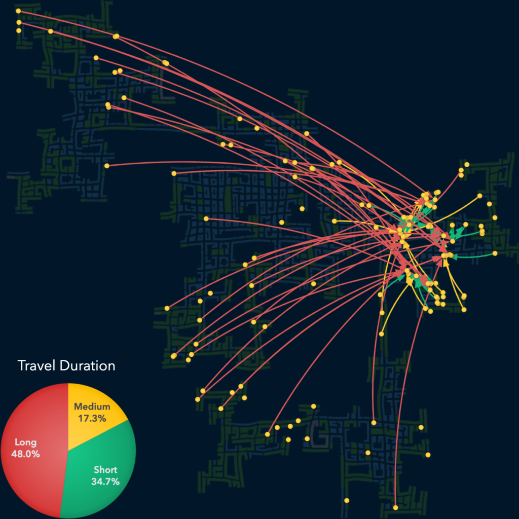
The traffic patterns of the city depend very much upon the time of the day. There are several potential areas of interest. Many people are commuting to work and increased traffic is measurable during 8-9AM and 4-5PM each day. In particular, the two connecting gateways in the north and southeast show consistent traffic bottlenecks at peak hours.

Breaking down the traffic patterns based on the business district they are traveling to reveal more nuanced patterns. For example, almost 50% of all employees traveling to the Eastern Business District do so from the western parts of the city, which can take over an hour.
We have selected participant 40 as our first case study. This 55-year-old lives in a household of three with children and works for two employers during the year. Initially working at job #228, this participant tried three other jobs for a few days until job #534 started in April of 2022. This employment change is also reflected in the change of daily travel patterns. Workdays changed from Monday through Friday at job #228 to Friday through Wednesday at job #534. The participant also received a pay increase ($2) for job #534.
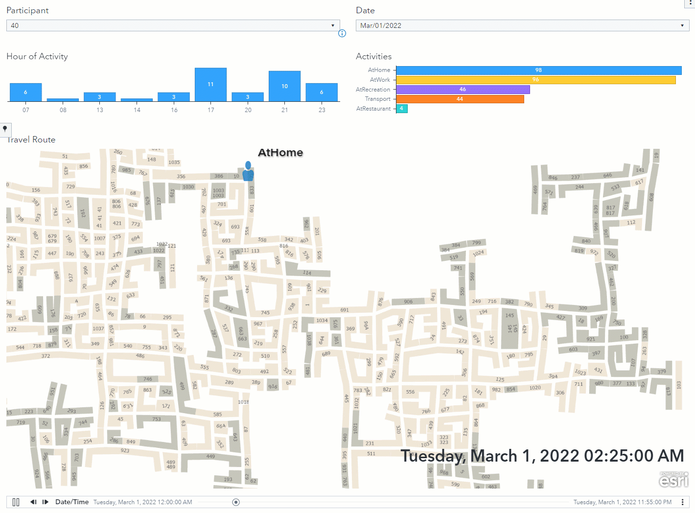
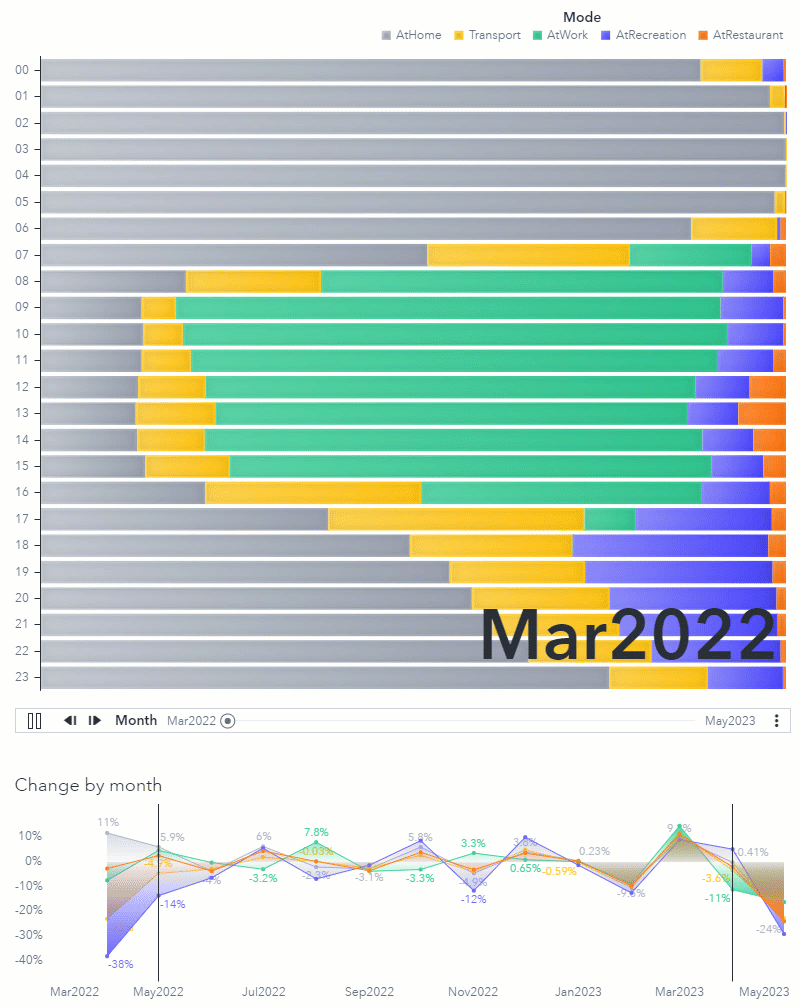
Participant 40's activity dashboard reveals their daily life. The participant was typically at home between 1-7pm or engaged in recreational activities between 6-11pm. Lunches were usually eaten at a restaurant at 2pm. During the year the overall activity changes as shown in the visualization animation.
You can find the complete set of visualizations and findings in the submission form linked below.
Results
We provided our findings in video format highlighting some of the approaches taken when analyzing the VAST challenge data:
| Challenge 1 | Challenge 2 |
We also utilized the SAS Visual Analytics SDK to provide interactive access to all visualization in the submission. You can view all visualizations in the submission by exploring the related forms for Challenge 1 or Challenge 2.
The VAST Challenge provides a great opportunity to validate our software against real-world scenarios using complex data sets. Not only do we learn from these projects, but we also send feedback to our development teams to further improve product capabilities for customers.
The team
Spending time on VAST challenges is always fun but also requires a team with lot of commitment and technical knowledge in various areas of technology. This team was led by Falko Schulz, with Stu Sztukowski, Cheryl LeSaint, Steven Harenberg, and Don Chapman all making significant contributions. Also huge thanks to Chelsea Mayse for the willingness and thoroughness in producing beautiful video summaries. None of this would have been possible without each of you.
Thanks again to the entire SAS team!
References
- VAST Challenge 2022
- Visual Analytics Benchmark Repository
- Challenge 1: YouTube Submission Video - Submission Form
- Challenge 2: YouTube Submission Video - Submission Form
- SAS Institute Inc. SAS Visual Analytics. (Online.) 2022.